Background
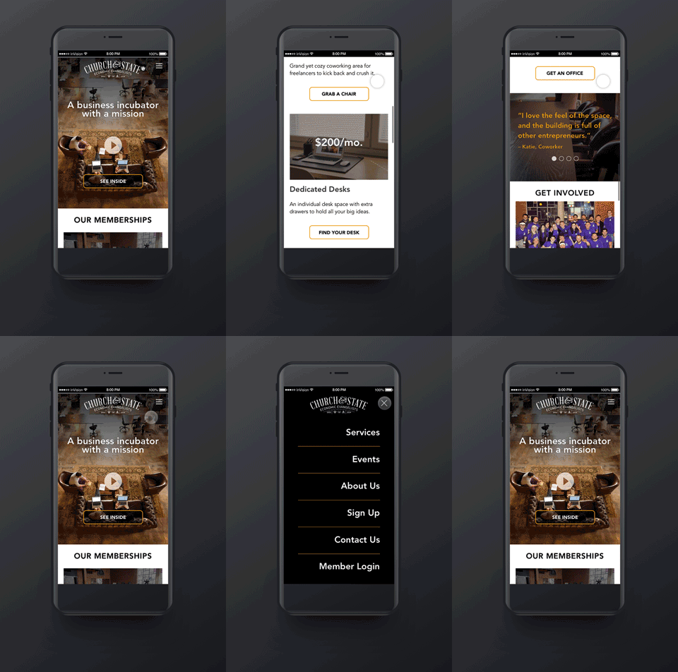
Church and state is a unique business incubator and co-working space located in downtown Salt Lake City, Utah. C&S serves as a physical space for entrepreneurs, freelancers, and startups. The most important part of Church and State is the community that has been developed within the region due to public events and educational courses at DevPoint labs. Being a nonprofit, Church and State is financed with money from paying members of the community. These membership types fall into three categories: coworker, dedicated desk, and private office space.
Problem Statement
Church and State approached us with an issue: how do we find new ways of increasing C&S memberships (especially private office tenants) and getting more community involvement in our events?
Stakeholder Interviews
I conducted stakeholder interviews with board members of the Church and State nonprofit organization. From these interviews I concluded that due to resource constraints that prevented formal marketing efforts and the hiring of more C&S staff, a simple redesign of the C&S website would be the best method of converting more visitors into members. This would also give C&S a better opportunity to showcase their unique work space and highlight more community events, yielding greater participation and subsequently higher membership.
Solution
I started my design process with some simple sketches of a potential homepage redesign. These would later be transformed into high fidelity wireframes.


